New Collection of Language Switcher Designs by Digidop

Anyone who has ever worked on—or even just thought about—website design is aware of this: it's not so easy to find the right balance between a beautiful and attractive design. Nor is it easy to find a design that provides a simple and effective user experience. This is true for all the elements of a website, and in this article, we're going to be even more specific by focusing on the language switcher buttons.
As well as being a web content translation solution, Weglot also makes it possible to publish a site in several languages from a UX point of view, thanks to a language switcher button. Once you've integrated Weglot into a website, you'll find a default button that's as simple as it is effective. But if you're feeling creative, you'll probably want something more personalized. In that case, you can take advantage of some basic settings, use templates, or even design your own button if you're a master of the CSS art.
In this article, we're going to take a look at these language switcher templates, which you can find in our own Switcher Gallery. For even more options, have a look at our collection, made in collaboration with Finsweet.
About the Collaboration
Several years ago, we collaborated with Finsweet, a web agency well-known within the Webflow community, on several language switcher designs that could be cloned and reused on any Webflow website. It’s even available to use on any technology. It's been a huge success, as these language switchers have been copied more than 8,000 times on all kinds of sites!
However, more and more designers, and in particular web agency teams, have started to think outside the box by tweaking or even designing their own switchers to offer a unique experience to the users of the websites they develop.
And that's obviously the case with Digidop. Founded in 2021, this web agency is the first and only French agency specializing in Webflow to hold triple accreditation: Webflow Expert, Client-First and Webflow Global Leader. Since then, the agency has completed more than 60 web projects for clients in a wide range of sectors and has shared its know-how through free content and an online academy. Florian and Thomas, the two founders of the agency, have been among Weglot's most active partners since the very beginning. They have shared their expertise of Weglot to their community via various documentation and videos, but above all they have always been willing to provide relevant feedback on Weglot, which has enabled us to continually improve our tool.
When we thought about offering a new collection of language switchers in collaboration with an agency, we knew that the experience and the critical and technical eye of the Digidop team would lead to a fruitful collaboration.
So the first step was for the Weglot development team and the Digidop team to think about how to improve the technical integration and behavior of the switchers to make it as seamless as possible. Then, it was the Digidop team's artistic and design talents that came up with 5 language switcher designs, which we'll present to you in detail here.
5 Language Switcher Designs to Use on Your Websites
Minimalism and sleek lines have been a big trend on the web recently. And it's exactly this trend that Digidop’s first language switcher set follows. It's a simple dropdown, quite similar to the one offered by default by Weglot, but with very simple lines. Easy to handle for the user, but above all, very universal, adapting to all website designs.
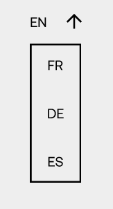
To keep things minimalist in terms of UX, here's the second language switcher. The name of the language, an arrow, and nothing more. This language choice button is universally accessible and won't clutter up the design of your site. Simple, effective, and unobtrusive.

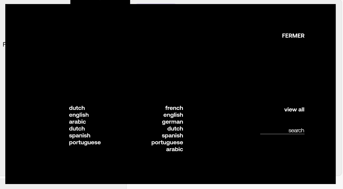
One of the limitations of these very simple designs arises when a site offers a large number of languages. The language switcher must remain simple and not look like a shopping list. To deal with this while maintaining a streamlined design, the Digidop agency has developed this third language switcher, which can be accessed by simply clicking on language to open a language selection window. Menus in the form of large windows are also a recent trend on websites. This language switcher is ideal for sites with many languages.
When surfing the web over the last few months, you've probably come across sites with very few colors, or even two-color sites with strong contrasts. To achieve a pretty and effective result, you need to be careful to keep the elements uncluttered. This is exactly the challenge taken up by this fourth language switcher. Here you choose your language by clicking on one or the other, like a light switch. Of course, this design works best if you only offer 2 languages.

In the same vein, some sites are pushing the bichromatic, rough-and-tumble approach by using large, sometimes bold, fonts—going so far as to use capital letters. This is what the Citadium site offers. Based on this trend, the Digidop team has come up with this 5th and final switcher. It can be used for 2 or a large number of languages and ensures that it is easily accessible by the user.

These language switchers are designed for you to use, toy with, or even be inspired by. You can clone and customize them to suit your design and UX. For this new collaboration, and based on the recommendations of Digidop, we've taken this collection a step further by offering you the chance to reuse them on the front end. You’re also free to use them during the mock-up phase of your projects.
Thomas Labonne, co-founder of Digidop, reveals all the secrets of this collaboration and explains how to use the language switchers directly on Figma in this video. Here, you’ll find the Figma file.
Then, if you want to take the plunge and reuse these language switcher templates directly on your Webflow site, here you will find all the clonable components, and I let you with Florian Bodelot, co-counder of Digidop, will guide you through the use of these language switchers.
Conclusion
It's now up to you to enjoy reusing these components in your website design projects. We would like to thank the Digidop agency team for their feedback, technical support, and great design skills. Don’t forget to check out their educational content, which will help you to take your projects even further.
As web design is constantly evolving, we are planning to release new collections of language switchers. So if you have any design ideas, don't hesitate to let us know.

Time to open your website to the world
Get started for free and have a multilingual website up and running in minutes.

Ready to display your website in multiple languages?
Try Weglot on your website for free (no credit card required).

Thibaud Guerin