

Best Practices for Designing a Language Button

When it comes to your localization strategy, a multilingual site should be on the top of your agenda. And if you’re already running one, you should probably know that the easiest way to allow visitors to view your content in their preferred language is with an intuitive and obvious language button on your front site.
Investing in a multilingual site is a smart choice with the Localization Industry Standards Association (LISA) showing that on average every €1 spent on localizing your website yields €25 in return. A language button is a key component of any multilingual site, enhancing not only your ability to attract and retain new customers but also playing a key role when it comes to user experience.
Designing the right language button for your site is therefore a key consideration to make, so in this article, we’re going to take a closer look at designing and customizing the perfect language button to implement on your site.
Customizing Your Language Button
Anyone who’s got a language button themselves, or frequently visits multilingual sites will know that there are lots of types available out there and that the degree of customization when it comes to making your own is quite high.
That being said, as you would’ve probably noticed, some are definitely more effective than others. So let’s take a look at some of the do’s and don’ts when it comes to making your own language button.
Flags or No Flags?
First and foremost, one of the biggest considerations you’re going to have to make when it comes to customizing your language button is whether or not you use country flags. While a flag represents a country and not a language, it is still quite a common practice on multilingual sites. So what should you do?
As United Language Group points out, flags were never created to depict languages nor do they represent them.
For example, consider the United Kingdom’s flag 🇬🇧 . This is often used to depict the English language, however, this is not an entirely accurate representation when we consider that countries like Ireland 🇮🇪, Australia 🇦🇺, the United States 🇺🇸 , and even Jamaica 🇯🇲 also use English as their first language.
Each of these countries have unique identities, distinct from their languages and so this risks being culturally insensitive. This is why some think flags should only be used when you’re providing country-specific content.
However, the use of flags on your language button can equally be beneficial. Firstly, from a design perspective they can be colorful and space-efficient, which can be a great option if you’ve little room to work with. Furthermore, flags on your language switcher add a splash of color which makes it easier to see your language button and allows website users to find it quicker.
Here we see that French eyewear brand Jimmy Fairly has opted to add flags to represent the different languages along with language initials as opposed to the full word.

Language Button Location
Following on from things that make your language button more apparent, the location of your language switcher on your webpage must also be considered. Of course, this may be already decided upon based on other features you already have on your site.
As we saw above, Jimmy Fairly has opted to place their language button on the top right-hand corner of the screen. However, if we look at another example such as Youth With A Mission, you’ll notice that they’ve opted to place their language button in the bottom right-hand corner of their webpages. So, which is more effective?
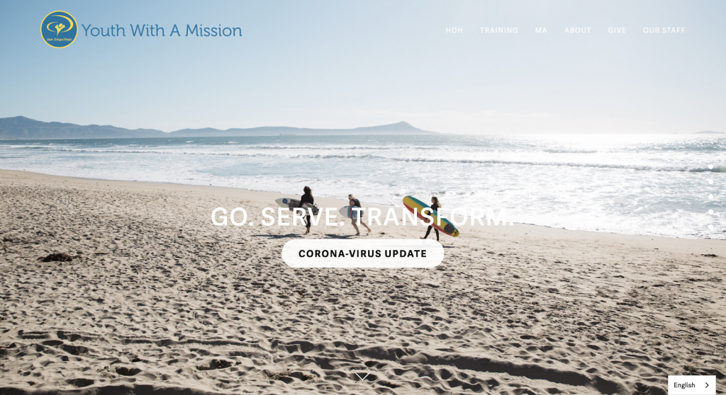
Placing your language button in the bottom right of your webpage means it falls into the terminal area of an individual’s vision which is essentially where they’re most likely to rest their eyes and engage with the language button.

So basically, in terms of the discoverability of your language button, from a location perspective, the bottom right is scientifically your best bet.
However, does that mean that Jimmy Fairly has got it wrong? Absolutely not. Perhaps they had empty space on their header they needed to fill, or already used the bottom right for some other feature or pop up.
As we saw, Jimmy Fairly opted for flags which makes their language button immediately obvious to website visitors. While Youth With A Mission didn’t go for flags, they did optimize their visibility with the position of their language button. The point being: you need to factor in what works for YOUR site, and what works for one mightn’t necessarily be the best bet for another.
Note: if your site mainly operates in RTL (right to left) languages such as Arabic, Hebrew, or Farsi, you may want to consider putting this language changer on the bottom left-hand side of your webpage as the location of the terminal area shifts in this format.
Full Name or Initials?
Another FAQ that comes up is whether or not you should add the full name of the language on your language changer. Well, before you even consider this – what you should do is make sure that each language is shown in your site visitor’s own language.
For example, if you’re operating a site catering for English, French, Italian, German, and Spanish. Your language changer should read: English, Français, Italiano, Deutsch, and Español.
If it’s not already obvious, this is because a Spanish speaker may not recognize the English word for their language as it’s very different from Español.

This is exactly what Bluetooth has done so on their own multilingual site, to great success. Not only is this beneficial in a practical sense for website visitors, but it also enhances the user experience in another way; it shows them you’re sensitive to their needs and value them as customers.
While, off the cuff, associating your language button with brand loyalty and customer retention might seem slightly drastic, in reality, in an increasingly customer-centric and competitive commercial environment we operate in, it’s the little details like these that can make the difference.
With that clarified, the next question is whether or not you keep the full language name, or opt simply for the initials.
Language Button Icons
You may have noticed in the above image, that Bluetooth’s language button is actually an icon, in this case a globe that drops down upon clicking. The question is, are icons a good way of representing your language button?
When you use an icon to indicate your language button, there’s always the risk that some website visitors may not understand what it represents and therefore won’t see that additional language options are available.
A good idea here is to try to use an icon that is globally recognizable. This is what Bluetooth has done with theirs, I mean what’s more globally recognizable than a globe itself?
A quick Google search for ‘language icon’ and you’ll quickly see globes or speech bubbles are coming top of the search.

Furthermore, another recommendation we’d make for anyone wishing to use an icon to represent their language button is to place another language button (ideally labeled) in the footer or another part of the webpage to ensure visitors don’t miss the opportunity to browse in a language that best suits them.
For example Uber makes sure even if website visitors have missed the language options at the top of the page, they’ll still have the choice to change in the footer.

After all, this investment in UX (or user experience) will in turn benefit you as a business. Research conducted by the CSA shows that:
– 72.4% of consumers said they would be more likely to buy a product with information in their own language
– 72.1% of consumers spend most or all of their time on websites in their own language
– 48.6% of consumers will only buy on websites presented in their own language
Language Redirection?
Automatic language redirection is a common feature of many multilingual websites and changes the language of the website based on either the browser language of the web visitor or the IP address of the visitor.
For Weglot users, there is the option to use the nifty “Auto-Switch” localization feature that automatically redirects a user to a specific language based on their browser language. Say you have your website available in two languages, English and Spanish, the feature works in the following way:
- If the browser language is Spanish, redirect to the Spanish site
- If the browser language is English, redirect to the English site
- If the browser language is neither English nor Spanish, an auto-switch fallback option can be selected, for example, English might be chosen as the default language as it is more widely spoken.

So, the question is, if you’ve set up automatic redirection can you get rid of your language button? Absolutely not.
With reference to the EN-ES bilingual website above, say you have a bilingual German-Spanish speaker whose browser language is set to German. Under these redirection rules, the visitor would be redirected to the English version of your site.
Therefore, it’s imperative that even with language redirection enabled, web visitors still have the option to change between languages via the language button, otherwise, this visitor would not be able to access the Spanish version of the site which they would understand.
Key Takeaways
- Language buttons are highly customizable and play a huge role in improving the overall UX of your multilingual website
- The visibility of your language button is a must, consider whether you’ll use flags to make it stand out, optimizing its location on your webpage, or both!
- Use the full name of the language as opposed to initials, also be sure to write the language name in its own language! Italiano not Italian
- Language redirection features can be a great addition to your localization strategy, however, don’t let this come at the expense of your language button. It’s both you and your visitors who could lose out!
Adding a Language Button with Weglot
Going multilingual and adding a language button onto your front site allows you to open up your site to new customer groups and work on increasing your sales and profits. Thankfully, Weglot makes adding a language button to your site a seamless process, providing simple but effective and customizable language switcher options.
A well-designed language button blends perfectly with your site’s design and is the cherry on top when it comes to user experience.
Why not try out Weglot’s 10-day free trial to see for yourself how a language button can give your site new dimensions.

Time to open your website to the world
Get started for free and have a multilingual website up and running in minutes.

Ready to display your website in multiple languages?
Try Weglot on your website for free (no credit card required).

Sean O'Hare


.jpeg)


