

Try Weglot for free


As businesses and products reach more international markets, with ever-increasing speed, digital is life-and-death: your company’s website needs to reflect your international users’ needs and preferences..
User expectations are continually intensifying, and the number of ways they can become easily frustrated and put off by a site is increasing as a result. This is one reason why user experience design services have gained a lot of popularity in the B2B world these past few years; they provide professional help to shed light on the UX problems of a site.
One of the most common—and most easily avoidable—UX problems on sites with an international audience is language.. If a user lands on your site—presumably because they might be interested in its content—but finds that there’s no way to read it in their own language, they’re most likely to bounce..
Although the language barrier is just the start of the potential problems. In order to have a site that can effectively reach users of different national backgrounds, following these UX principles is critical.
In order to tackle the primary issue—changing the language of a site—the user needs to be able to easily find the magical place on the page (a button, a menu…) that will allow them to switch to their language; that place is called the global gateway.
The global gateway directs the user to a specific localized version of the website. In good UX-designer fashion, we need to assume that the initial language is not one with which the user is familiar; that makes our work a little trickier, as they now need to be directed to their own language in a way that does not require any written commands.
It’s generally considered that the best way to design a navigational system is to place the search on either the very top of the page or in the footer; these are the two most common places users look for information, capabilities, and menu items.
The example below is from Airbnb’s website. They clearly indicate on the left side of the footer that the user can change the language—without even writing “language” or any other verbal command. The dropdown menu is a kind of universal symbol for choice, and as long as the user can open it easily and find their language on the list without having to scroll too far, they probably won’t have any problems overcoming this first linguistic UX hurdle.

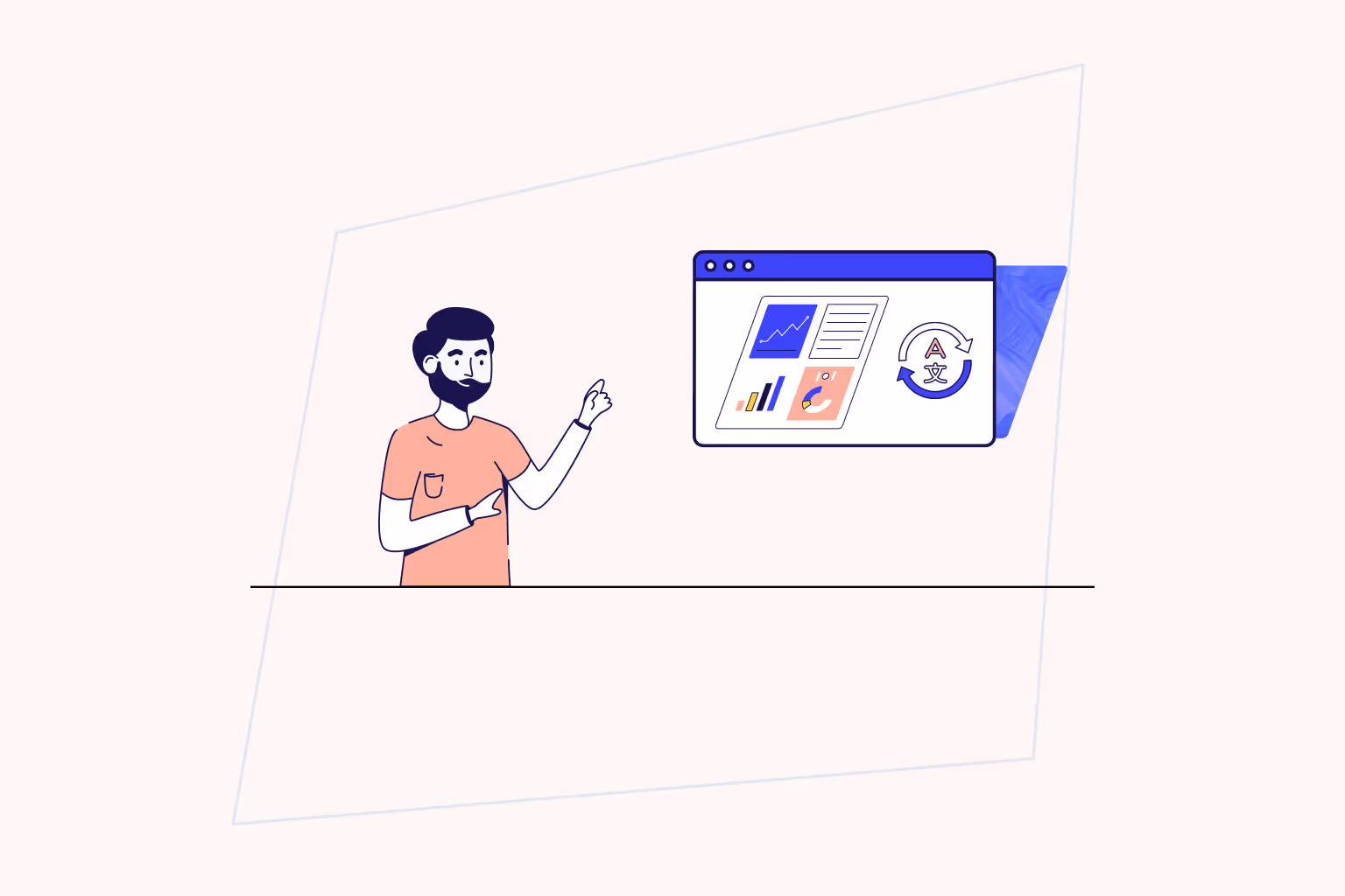
If your site does not have the option to change the language on a site, then the first step would be implementing that capability. An easy way to do this is by using a third-party app or integration, like Weglot, for whatever CMS you’re building your site on.
Besides ensuring the user has access to your site content, the most important element is developing consistency between all the multilingual versions of your website.
Every user, regardless of which site they’re on, should have the same smooth and intuitive user experience. Since establishing UX is an intricate process, hiring a UX design agency to ensure seamless results is often the most effective route.
Let’s stick with the Airbnb example, as they do an excellent job keeping to their brand, regardless of the language of the site. Just take a look at their English site compared to their Turkish site:


There’s literally no difference in the site design—its colors, typography, and layout stay the same. Both Turkish-speaking and English-speaking users get the same clean, pink-dappled interface.
*One thing to keep in mind—Airbnb didn’t think to replace the images with text on them, and a non-anglophone user might be confused about what a “Grime Scout” is or where “All Artists Here” is actually taking place. Imagery is a big consideration, as we’ve mentioned before on our blog.
Once you establish a consistent branding across your sites, incorporating elements of localization to the site can actually end up being extremely effective in encouraging engagement—the user will feel that their experience is more personalized.
There are other ways to localize your site than just changing the language of text content. Especially when it comes to selling something, be it a product or service, including region/language-specific imagery and offers is a means of showing potential customers (or just site-visitors) that you’re active in their corner of the world, and that they might get something on their end out of engaging with you..
So let’s go back to that Airbnb example. We noticed that the images weren’t localized, and featured English-language text. This is a pretty easy fix—the site manager could ensure that the experiences advertised on that front page are closer, regionally, to Turkey for Turkish-language site users, and especially that the imagery used in the adverts has been redone to include Turkish text.
Since different words in different languages have vastly different lengths, keeping in mind potential spacing issues should be a constant question when designing a web page.
For instance, “Add to Cart” is eleven characters in English, but in Dutch, it is twenty five characters, “Aan winkelwagen toevoegen,” which takes up twice as much space. To keep consistent, you may have to pay attention to the font sizes and styles you use across pages. Always preview all of your pages and choose a font that is available in all the alphabets/scripts used for your destination languages, and make sure the font(s) you’ve chosen for your text (and titles!) look good in all of them.
Designing a global website is complex. Language doesn’t just affect text: it affects everything that that text touches and references, as well as all of the visual elements of a webpage that interact with the text.
The first step in designing a site to be multilingual is signing up for a service like like Weglot.
The next step is to make sure you have a UX design company to ensure that every page is visually appealing and user-friendly. Afterwards, you might even want to get a professional translator to take a final look at your multilingual sites—and Weglot can help you with that, too.

We’ll get your first languages live. You decide how far you want to go. Try Weglot for free today.
Trusted by 70,000+ global brands


Weglot is tested and trusted by brands worldwide since 2016. Join them today.


The best way to understand the power of Weglot is to see it for yourself. Test it for free and without any engagement.
A demo website is available in your dashboard if you’re not ready to connect your website yet.
