

4 visually appealing ecommerce websites to take inspiration from

What makes an ecommerce website stand out from the crowd? Visually appealing website design. It’s undoubtedly one of the easiest ways to grab the attention of your new website visitor, build trust and hopefully lead to a sale.
Great website design tells the story of your brand instantly. After all, it takes just 0.05 seconds for a user to form an opinion about your site. And, in the world of ecommerce that can be the difference between a sale or a bounce.
In 2019 consumers spent almost $3.46 trillion shopping online so whilst the market is bigger than ever, so too is the competition. It’s never been more important to make your mark with your online presence when you’re selling online – even more so for those without a physical store.
So, with that in mind, we thought it would be a good opportunity to take a look at some ecommerce websites nominated for their outstanding design from the Annual Awward’s, and just why they’re so visually appealing.
These are no ordinary ecommerce websites – let’s take a look at our top 4.
Awwward nominated ecommerce websites
Stripped back simplicity

The first on the list is Shopify store Jorik. This apparel store has made a site that perfectly reflects the clothing it sells. Their stripped back, minimalistic approach to ecommerce lets their products do all the talking.
The strong use of typography and animation – in particular the way the menu bar moves, plus an animated banner and text that types as you click on the products all echoe the design nature of the items they’re selling online.
When it comes to displaying their products they’ve gone for a full page view per item to let you see every detail up close and personal.
Perfect design harmony is what this ecommerce website sets out to achieve, with the subtle use of animation used throughout and a simple color palette of black, white and red – you can see exactly why this ecommerce retailer came in second place in the Awwward’s.
They’re visually appealing website speaks volumes to their customers.
Cutting back on content
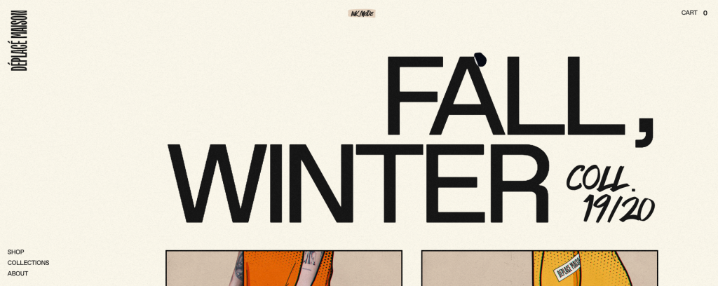
This is disruptive ecommerce design at it’s finest. Deplace Maison prides itself on its independent values and you can clearly see that reflected in the design and style of their site.
They’ve created a website that doesn’t necessarily shout ecommerce. It has rather a comic book blog feel to it. For a brand that oozes exclusivity, their site appeals visually to their demographic.
Free from the distraction of too many words, the use of minimal content means the products take centre stage. Built on Webflow, Deplace Maison uses playful design that utilizes everything from an animated mouse to a fixed side menu bar.
However, when you start scrolling through their store and purchasing their items you get the feeling you’re going deeper and deeper into what initially appeared as a simplistic website.
Using storytelling to sell

Storytelling at its finest, White Tail Gin builds an impressive narrative about the history, process and what makes this spirit stand out.
Built with WordPress, this gin retailer uses full page scrolling to take you through the 3 steps that build their product, with the last step giving the website visitor the opportunity to purchase.
It can be a tough job selling a product online that doesn’t rely on its look or functionality, but White Tail Gin does a great job of selling the story of their gin.
When you arrive on the page you’re met with a beautiful image with all the elements that make up the product. Sticking to their brand colours and subtle pops of colours from the ingredients made to pair with their product – White Tail Gin manages to deliver style and simplicity.
Immersive experience

Where do we start with this one? An immersive experience that uses a creative blend of video, animation and storytelling to sell its line of hair care products.
Nature Elixir, a custom built ecommerce website showcases how high end products couple well with high end design.
This luxury hair care brand doesn’t hold back when it comes to strong visuals and animations. They’re all about giving you an experience straight from the moment you enter their site.
When you click into the store you’re met with a quote whilst the page is loading. They know the high use of animations might slow their site down, so they keep their website visitors engaged at a point where people might bounce.
With three products on offer, website visitors simply need to scroll between the products without any need for clicking back on your browser. This clever piece of website design the right amount of encouragement for you to buy all three products.
So, you’re selling internationally?
Whilst we’re in no doubt that these ecommerce websites scream great design (after all there’s a reason why they’re nominated for an award), we can’t help but notice something is missing when it comes to reaching the global growth many ecommerce entrepreneurs are looking for.
In particular, these ecommerce websites share a common ground. They all offer international shipping. But, what might be missing you ask? Multilingual functionality of course!
We’ve spoken about this in great length before. If you’re selling internationally, offering a website in the languages you’re shipping to is an absolute must. After all if your potential customer can’t understand the buying process, then you don’t stand much chance of making a sale.
A staggering 55% of people surveyed will only purchase in their own language – which means you’re missing out on huge conversion rate opportunities.
If you translate your website, not only will your potential buyers be able to understand the buying process, but your company website will be visible in search engines for your target countries.
How to go multilingual

We’re probably guessing that at some point in your ecommerce journey you’ve thought about selling internationally and how you can make that happen.
The good news is that there is a simple solution that will translate your website, display the content and help you rank on search engines in your newly translated languages.
Weglot has been designed to help website owners translate their websites into multiple languages no matter what website technology the site has been created with – CMS or non-CMS (just check out our simple integrations here).
And, the beauty of Weglot (apart from the fact it’s a no-code tool) is that the long and tedious task of translating the thousands of product pages you might have on your site is made simple with a fast first layer of automated translation.
This will do the trick when it comes to product descriptions (you can even exclude URLs from being translated if you’re not planning on selling this item in a certain country).
But, for your homepage and other important pages? We recommend ordering professional translators through the Weglot dashboard to fine-tune your automated translations and make the most important pages of your site stand out.
It’s not just the translating and displaying of your website that Weglot takes care of. Another important aspect when creating a website is of course SEO. And, when you’re translating your website with Weglot, this is a step that has also been carefully considered.
Your translated website will be displayed under language specific subdomains or subdirectories which are highly favored by Google best practices. Weglot also adds a number of other necessary steps to make you visible in search engines – such as hreflang tags and translated metadata.
Interested in trying Weglot out on your e-commerce store? Start your 10-day free trial.

Time to open your website to the world
Get started for free and have a multilingual website up and running in minutes.

Ready to display your website in multiple languages?
Try Weglot on your website for free (no credit card required).

Elizabeth Pokorny


